Looking at a Shodō work – character, line, rhythm and space
4 min read · Published
In short
A Shodō work has three levels: what the character means, how it is read and how it is executed. Anyone can see the third level — in line, ink, rhythm and unwritten space. Two executions of the same character show how differently that can work.
Meaning, reading, execution
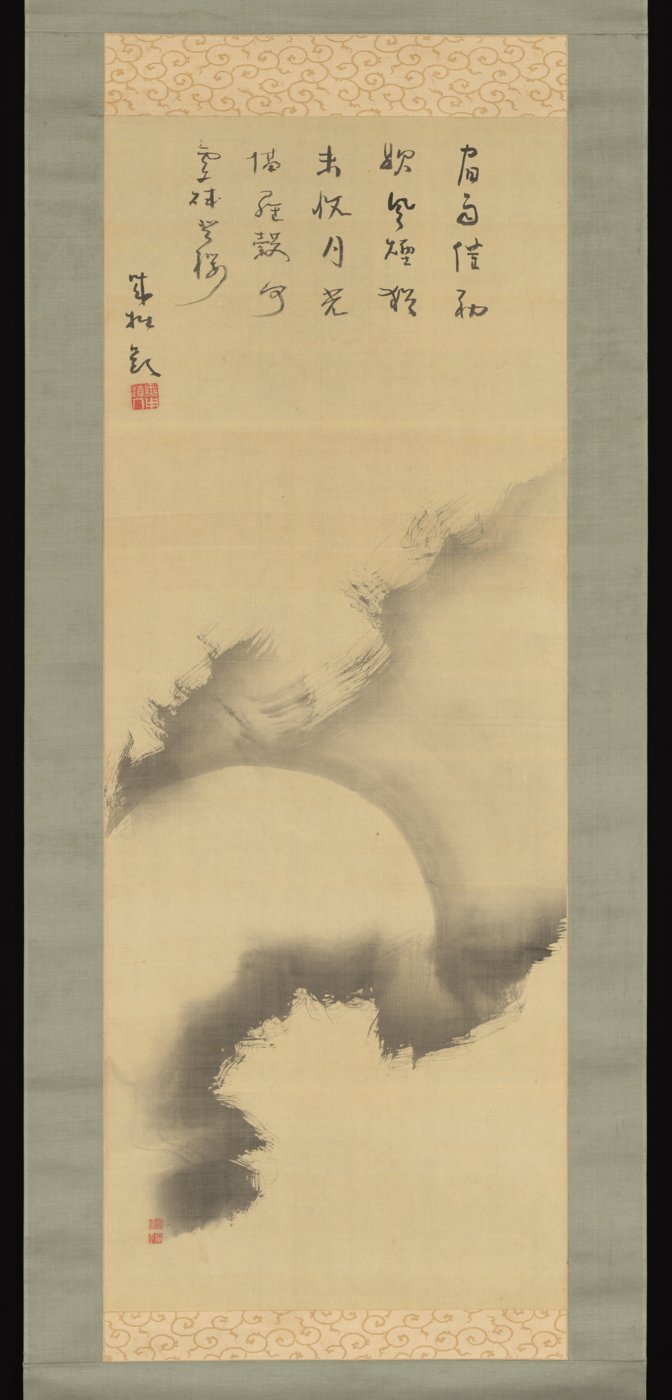
The character 雪 means “snow” and is read yuki. Both facts are in any dictionary. What makes a work is the third level: how this character was written here, on this sheet. Meaning and reading help understanding, but they do not describe what you see. Conversely, you need not be able to read a character to perceive line, weight and space.
Japan's Agency for Cultural Affairs describes Shodō as expression that writes language with the brush — legibility is therefore a foundation. How far a work departs from the legible standard form varies with style and intention: in standard script (kaisho) every stroke stands clearly; in cursive (sōsho) and contemporary single-character works, movement comes to the fore. The script styles are explained in “Understanding Shodō”.[2]
Line: entry, travel, ending
Every stroke has a start (kihitsu), a travel (sōhitsu) and an ending (shūhitsu). At the start you see whether the brush was set down pointed or broad; in the travel, whether the line stays even or swells and thins; at the end, whether it tapers, stops bluntly or turns into a splash. Width and density suggest pressure — exactly how fast someone worked, however, cannot be read reliably from a finished sheet.
Anatomy of a stroke
- Kihitsu – entry
- Sōhitsu – travel
- Shūhitsu – ending
- Kasure – dry, broken trace
- Nijimi – ink spreading into the paper
Ink and contact with the paper
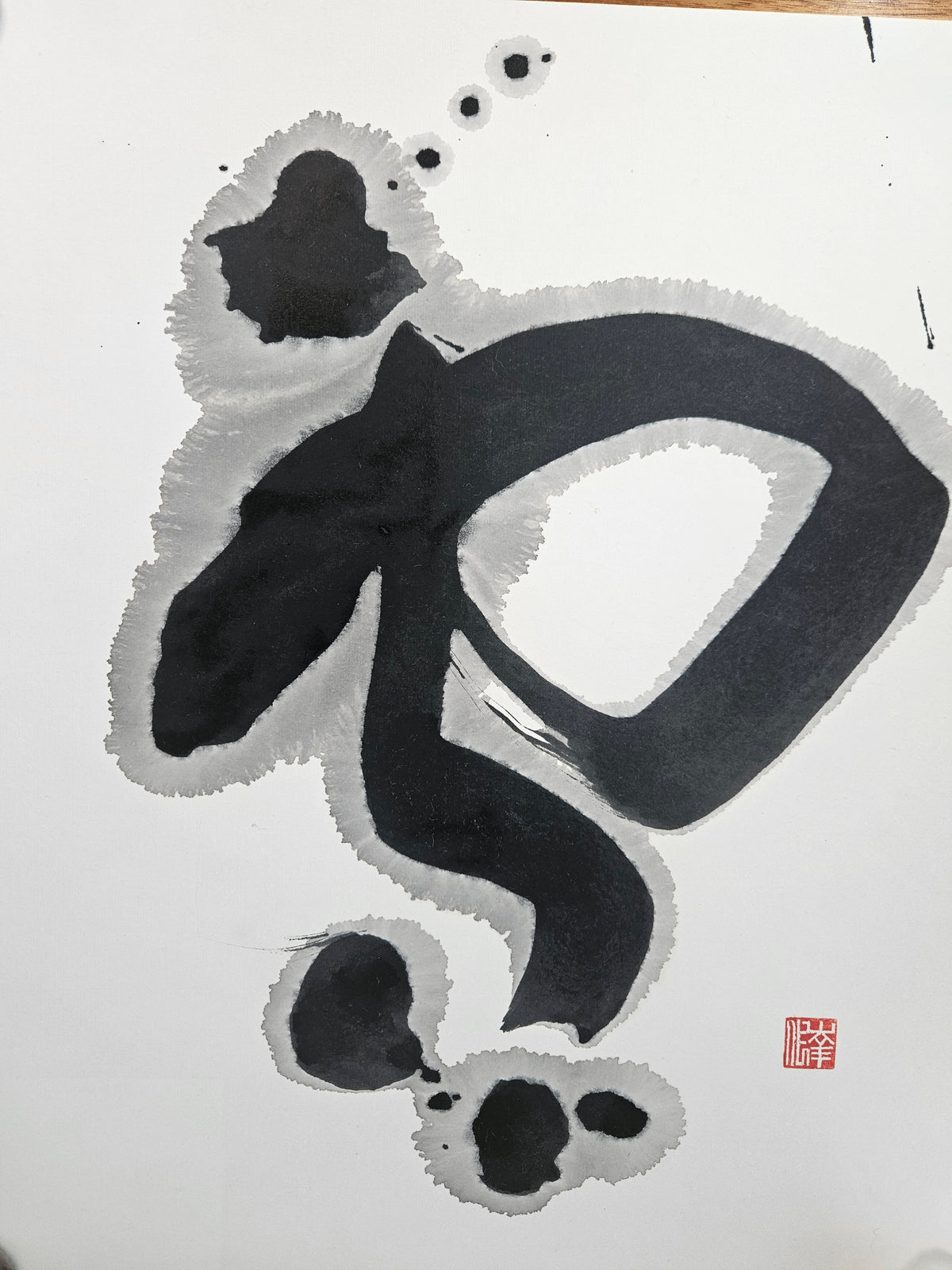
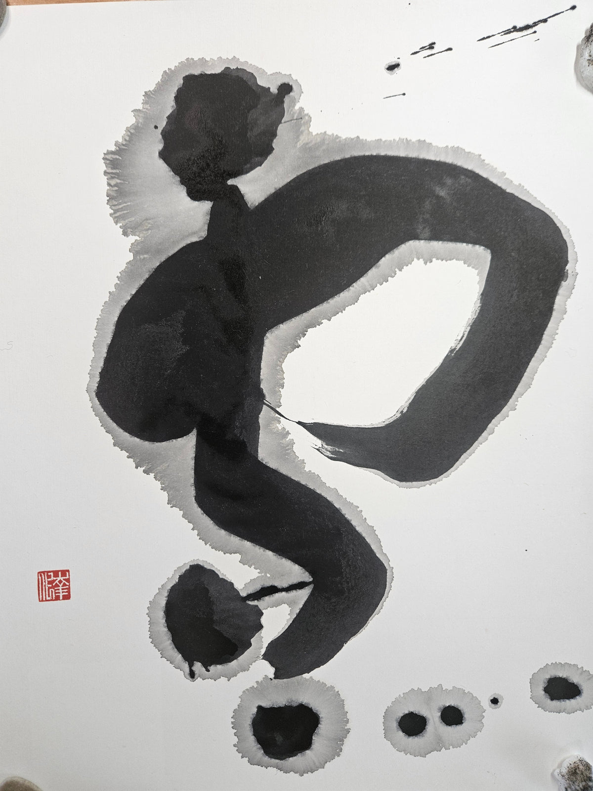
Look for differences within the ink: deep black, closed areas; grey transitions; light streaks where brush hairs only grazed the paper; and halos where water travelled beyond the stroke into the paper. Such halos are often lighter than the stroke and have a fine edge. They arise from the interplay of ink quantity, water and paper — more in the article on the tools.
Rhythm, composition and empty space
Rhythm comes from alternation: thick and thin strokes, dense and open areas, large and small parts of a character. With several characters, spacing and column fall are added. The unwritten area (yohaku) is not leftover but part of the composition — where a character sits on the sheet and how much space surrounds it clearly changes its effect.
Legibility and expression stand in tension. A very free work may be hard to recognise even for people who read the character, and gain strong visual impact precisely because of this; a clearly legible work can impress through precision and measure. Neither is better by default.
One character, two works: 彩① and 彩②
Takemura Chikako wrote the character 彩 (“colour, nuance”) in two independent works. The following observations are limited to what the work photos show.
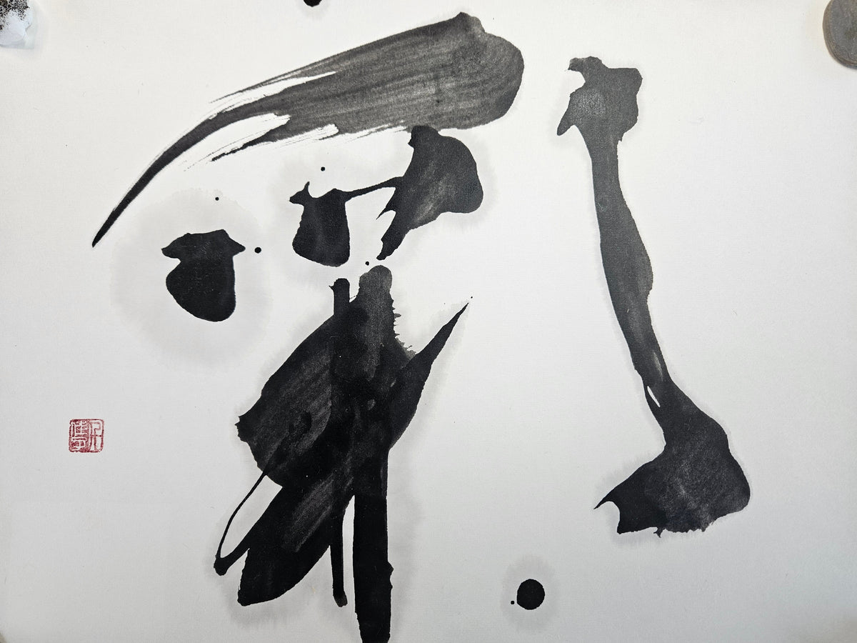
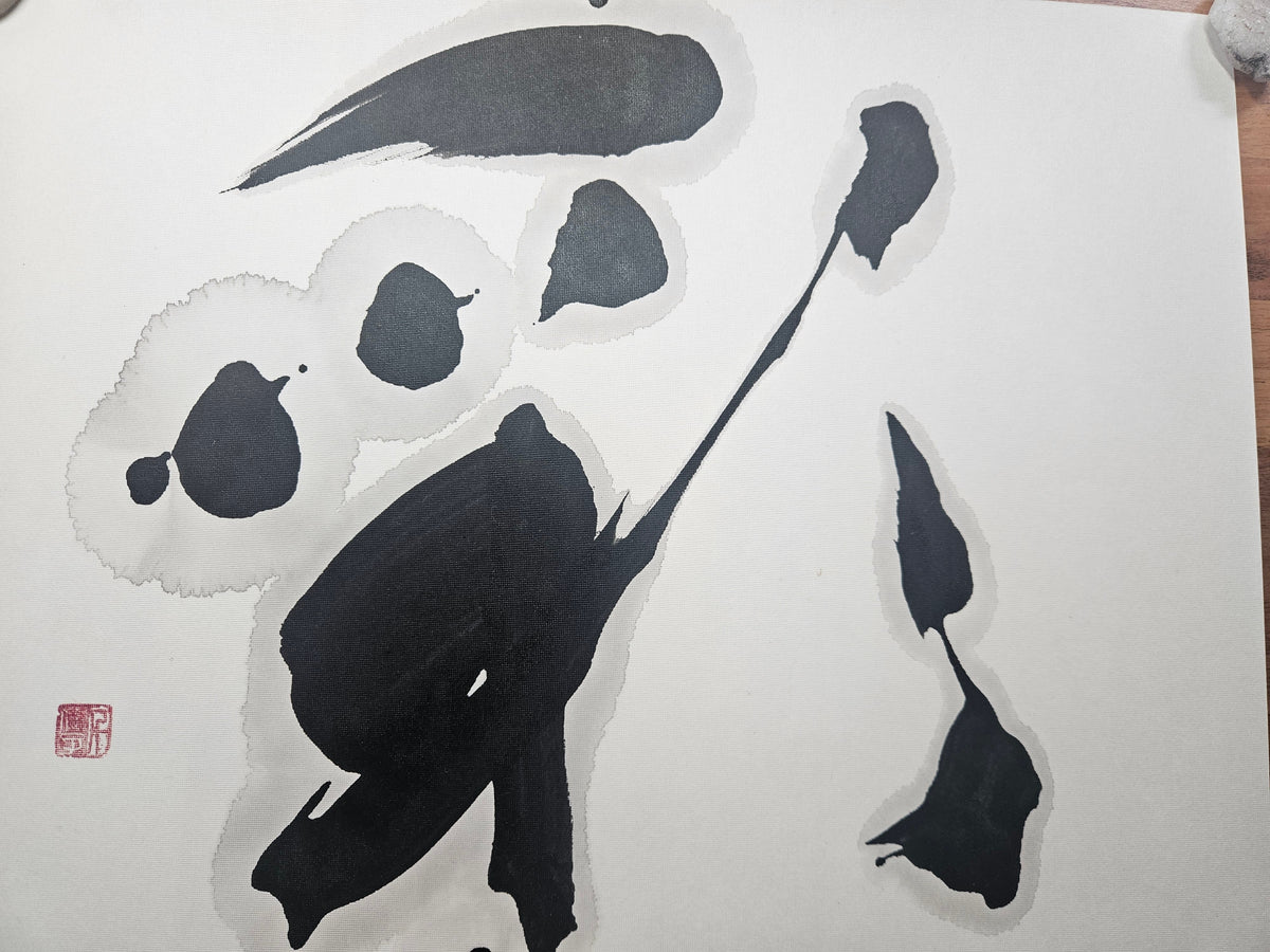
In 彩① a long sweep reaching to the left, with visible hair streaks, dominates the top; in the lower part closed, very dark forms lie close together. In 彩② the parts are more separated: round ink forms stand free, many surrounded by pale grey halos, and a long thin diagonal links them. In both works the red seal sits at the left. The same character thus appears once compact and heavy, once loosened and airy.
Something similar can be observed in 雪① and 雪② by Hatanaka Sachiyo: both show strong curves with grey halos and dots below the character; 雪② has a broader closed loop, fine splashes at upper right and a seal placed at the left rather than the right.
Signature and seal
Many works bear a signature and one or more red seals (rakkan). They indicate who made the work and are also a designed part of the composition: a small red square sets an accent and affects the balance of the sheet. A seal, however, is not automatic proof of authenticity — seals can be imitated. They are meaningful together with documented provenance and information from the artist or seller.
A short viewing guide
Questions and answers
- Do I need to know Japanese to understand a work?
- No. We state meaning and reading for every work. Line, ink and space can be perceived without knowing the language.
- Does the seal prove authenticity?
- Not on its own. Seals are part of the work and name the maker, but they do not replace documented provenance.
- Why do two works with the same character look so different?
- Because ink quantity, paper, stroke sequence, proportion and placement come together anew each time. Every sheet is its own execution.
Read on
Sources
- The Metropolitan Museum of Art, New York: Brush Writing in the Arts of Japan (Ausstellung / exhibition, 17.08.2013–12.01.2014). https://www.metmuseum.org/exhibitions/listings/2013/brush-writing (accessed 11 October 2026)
- 文化庁 / Agency for Cultural Affairs, Japan (広報誌ぶんかる) (吉野亨 Yoshino Tōru): 書道の登録無形文化財への登録について (15.10.2021). https://www.bunka.go.jp/prmagazine/rensai/news/news_004.html (accessed 11 October 2026)
- The Metropolitan Museum of Art, New York: Open Access at The Met. https://www.metmuseum.org/hubs/open-access (accessed 11 October 2026)
Image credits
- Seisetsu Shūcho, Moon amid Clouds, early 19th century — Seisetsu Shūcho 誠拙周樗 (1745–1820); The Metropolitan Museum of Art, Mary and Cheney Cowles Collection, 2020, 2020.396.11.
Source: https://www.metmuseum.org/art/collection/search/845132
Licence: CC0 1.0 (Met Open Access) · The Metropolitan Museum of Art, New York (Public Domain)
Edits: Resized and re-compressed as JPEG; not cropped, colours unchanged. · checked 11 October 2026 - Takemura Chikako, 彩① – Colour I, original, sumi on paper, 45.5 × 35.5 cm — Takemura Chikako 竹村千佳子.
Source: SumiFox
Licence: © Takemura Chikako – alle Rechte vorbehalten / all rights reserved · © Takemura Chikako; Werkfoto SumiFox / work photo SumiFox
Edits: Work photo from the SumiFox shop; resized, not cropped, colours unchanged. · checked 11 October 2026 - Takemura Chikako, 彩② – Colour II, original, sumi on paper, 43.5 × 35 cm — Takemura Chikako 竹村千佳子.
Source: SumiFox
Licence: © Takemura Chikako – alle Rechte vorbehalten / all rights reserved · © Takemura Chikako; Werkfoto SumiFox / work photo SumiFox
Edits: Work photo from the SumiFox shop; resized, not cropped, colours unchanged. · checked 11 October 2026 - Hatanaka Sachiyo, 雪① – Snow I, original, sumi on paper, 45 × 35.3 cm — Hatanaka Sachiyo 畠中咲菫.
Source: SumiFox
Licence: © Hatanaka Sachiyo – alle Rechte vorbehalten / all rights reserved · © Hatanaka Sachiyo; Werkfoto SumiFox / work photo SumiFox
Edits: Work photo from the SumiFox shop; resized, not cropped, colours unchanged. · checked 11 October 2026 - Hatanaka Sachiyo, 雪② – Snow II, original, sumi on paper, 46.5 × 35.5 cm — Hatanaka Sachiyo 畠中咲菫.
Source: SumiFox
Licence: © Hatanaka Sachiyo – alle Rechte vorbehalten / all rights reserved · © Hatanaka Sachiyo; Werkfoto SumiFox / work photo SumiFox
Edits: Work photo from the SumiFox shop; resized, not cropped, colours unchanged. · checked 11 October 2026